Thursday, 8 November 2018

Page Planning


Things I want to use from this contents page:
The layout on vibe's content page is unique and space is evenly distributed.The photography - monochrome colouring exception draws attention to the red. Also the use of Kanye West may contribute to the demographic being those who are culturally sophisticated.Typography - The black and grey with both the bold and smart font suggest the magazine is for those alike. 


I really would like to incorporate DAZED's structurally aligned layout as I would like to be able to focus more on the actual photography of my magazine. 

Monday, 10 September 2018

Schedule


Why do you think it's important to produce a schedule of activities when working on a production?
So that we can keep track of the essential steps we have completed as well as the ones that need addressing and completing so that important aspects are not missed out or forgotten.

Name 3 activities you're likely to struggle with?
I am likely to struggle with the photoshopping of my images as i want to make it look genuine. I will also struggle with scripting my audio visual piece as i want it to be phrased correctly and said in the right tone with energy.

What are you going to do in order to achieve these difficult activities?
 Organise my time well so that i do not have to rush these individual tasks allowing them to all look genuine and detailed. I will also revert back to my work in order to review it and receive further opinions on it.

Planning Task 1 - Equipment and Techniques

Planning Task 1

Shot one - 
Media Theory: Van Zoonen's theory states that "Gender isn't what we are it's what we do", this relates to my framing as the low angled shot suggests that my model is superior to the audience consuming the media, in addition to the high placement of her hand suggests a care free nature. 
The eye contact is a general convention of a fashion magazine as we see this in most high end magazines such as Cosmopolitan.


Friday, 22 June 2018

Statement Of Intent Practice Draft - 26th March 2018

How do you intend to use the four areas of the media theoretical framework to communicate meaning and meet the requirements of your chosen brief? (Approx. 400 words)

Media Language

Representation

Audience 

Genre
Audience:
Culturally sophisticated 
16-25 Year olds
 AB Class


Framing and angles:


I would like to potentially frame my shots in a similar way to this in order to reflect natural elements of the world suggesting that we all originate from the same source hinting the equality found inside the branding.

Moreover, the mise-en-scene may also be something of which I would like to reflect in my work, particularly clothing, in order to display different degrees of fashion and reflect the culturally educated section of the demographic.

Thursday, 7 June 2018

Location Information

The purpose of this task is for me to assess and identify the locations you're going to use for your photography/video.

Belhus woods South Ockendon


The Alexandra lake, West Thurrock


Casting info (Models)

This post is to assist me in identifying my models of which will feature in issues of my product for both the print version and website.


Thursday, 24 May 2018

Product Style Profile

NEA - Sketching and product profile

Learning Objectives:


  • K: the importance of sketches and planning in the decision making process of creating a magazine.
  • U: how to use sketches to influence your stylistic decisions.
  • BAT: undertake a creative task in which you start the decision making process in terms of style of your magazine.
In this post i am going to be getting comments on sketches i have created for my product in terms of framing, typography and layout. I will do 3 sketches for each page i will need to produced in the finished product.

Cover One:


Feedback: After asking a total of 5 people i have became aware to the fact that my framing should be more central in order to display clothing (hence fashion magazine) as well as needing a change in regards to typography as it has been agreed that it is perhaps hard to read due to the spacing in coordination to the layout.

Cover 2:


Feedback: After once again asking the five people for their opinions on my second cover draft on which i removed the tag lines; this was not appreciated as they said it looked too bare. Moreover, it is evident that there was too much bare space in this second draft that could've been put to better use.
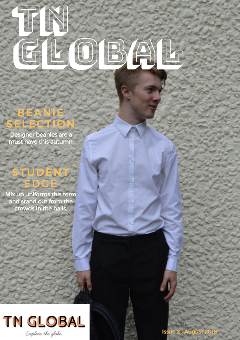
Cover 3 (Final):


Final cover profile - I have ended up with this front cover which links into the theme of exploration whilst not being too bare, tag lines are easier to read and overall more structured.

Index Page:


My index page will be a double spread featuring a photo of one of my male models covering an entire A4 page along with a caption proclaiming location and identity. Despite this being my first draft, after getting the opinion of others i have drawn the conclusion that it does not require improvement as text is not overbearing and design is floral fitting my homosexual brand.

Website home page:


Pencil Sketch will match up to digital draft.

Due to my exploration theme, i want my website to speak through its pictures hence why text is minimal and to the point. The colour scheme matches my logo with colours of orange and black showing a juxtaposition between day and night with orange being sunshine and black being the night sky, a key aspect in exploration is the sky and its weather as it can cast moods over particular days and events.

Thursday, 10 May 2018

My Mood Board

NEA - Mood Boards

Learning Objectives:

  • K: the advantages and disadvantages of using a mood board to inspire content of new media product.
  • U: how different types of images and fonts can affect the way audiences consume media texts.
  • BAT: produce a mood board that illustrates your initial ideas for your media product.
  • CO: Use media terminology throughout.


What brief did you choose? State the two products you're required to produce.
Magazine print/online - A Front cover and contents page for two print editions. An Online website.

What are the minimum requirements for your chosen productions?
Minimum of two models. Minimum of four photos for print edition. Two photos for website.


What is the target audience as prescribed in the brief?
Culturally Sophisticated 16-25 year olds in the AB Category.

What is your target audience for the products you're creating? (this needs to link to the audience profiling post).
Homosexual white/asian males in full time employment. With an interest in exploring locations, disagree with fashion norms.

In this task I'll explore different types of images, fonts and colours to use in both my print and online fashion magazine.  I shall be looking at different connotations and how these affect the way my target audience might view my product.  By creating this mood board I will also be exploring creative ways of how to present my work.

How did they helped you define content for your products?
I now know that i want my magazine's content to be simplistic in regards to the location so that it does not distract from the model yet still attracts some attention such as the fairy lights and flowers.

What will be your overall colour scheme of your productions?
They helped me pin the exact tones of colour that i'm wanting to use in both my magazine and on my website. I want the colours to reflect the theme of adventure, hence the green to symbolise the shrubbery and faded colours to reflect the grunge style.


What kind of images/shots would you use in your productions?
I would prefer to use long shots and mid shots to capture that element of adventure and mindfulness whilst simultaneously depicting a laid back yet preppy style in the centre, potentially using the rule of thirds.

What kind of fonts would you use in your productions?
My production will feature a font with connotations to metal to represent the scrap metal left in the wilderness from fly tipping, it will perhaps be soft at the edges to show age in rusting of metal.

What kind of mise-en-scene would you use in your productions?
Lighting:  Either cold green or warm orange.
Clothing:  Denim on denim or suit with braces.
Props:       Natural objects e.g. sticks and stones.


What kind of intertextuality would you use in your productions?
Forest shots i will link to the idea of Neverland in peter pan due to the shrubbery and small framed male models potentially using the iconic reflection shot in the lake.
Bathroom shots will like to the Netflix series Thirteen Reasons Why, shown by looking into the mirror.

Which media theory(ies) are you likely to use in your productions?
Butler is an important postmodern writer and has influenced Queer theory – theory which deconstructs and aims to destabilise apparently fixed identities based on gender and sexualities.

Thursday, 26 April 2018

Audience Profiling

My audience survey for Fashion magazines is linked below:

https://www.surveymonkey.co.uk/r/7KVNC3F

Review your results and copy and paste any graphs or charts given by surveymonkey.  Then you need to write up your findings in paragraph form including how you intend to use the information collated in your questionnaire.
You can use the questions below to help you write your analysis:

What did you find useful about the information collated? 

I now know that the style of print magazine cover I have chosen is one of which is wanted opposed to ones with bright colours and bold typography. Simplicity must be an aspect of my covers and content pages, so shorter tag lines in order to achieve further focus on clothing featured.

How are you going to use the information collated to establish/define a target audience for your product? 

I will aim my product at mixed students who are questioning their sexuality and want more diversity in todays' magazines in regards to things such as the tones and patterns they can wear or how they should portray themselves.


What does your audience expect to see in the product you're going to create?

They will expect to see simplistic tag lines and captions so that it will not distract from the diverse artsy photography alongside fashion that stands to be just as artistic with regards to patterns, potentially distressed clothing.

How are you going to use the information collated to come up with designs and house-styles for your product?

The house-style will match the layout of Vogue due to the results of my survey, the masthead must stand out alike. I may use the light and easy fonts of GRAZIA to add to the artsy photography making my audience satisfied with the slight change in design.


My Online Website Survey:

https://www.surveymonkey.co.uk/r/L3XCQS9

What did you find useful about the information collated? 

I now know which location I would like to set my photography in, either a forest or a bathroom. Though this will not be my focus primarily, I think location will be a very crucial aspect to my magazine in regards to the adventurous theme and purpose.

How are you going to use the information collated to establish/define a target audience for your product? 


Find a common ground for my brand throughout the print magazine and online website. Hence my website must also feature content of which is simplistic and artsy with regards to its layout and overall theme.

What does your audience expect to see in the product you're going to create?


My audience is expecting to see an exploration in both location and fashion norms. They would like some individualism, a website with an abnormal layout, something they have not seen before. Captions are expected to be witty and meaningful whilst outlining the contents of the images.

How are you going to use the information collated to come up with designs and house-styles for your product?

I got a summary as to how my audience would like my models to look in terms of fashion and how my website to look in terms of text to picture ratio, text is only wanted as a minimal.

DEFINE YOUR AUDIENCE


My Product is aimed at bisexual white/mixed males from the age of 16 to 25 in the AB category in full time employment questioning their sexuality, this maturity will allow them to appreciate certain themes as they will be culturally sophisticated. In regards to psychographics, my audience will be explorers who look for individualism and experience as well as valuing the differences in the magazine.

Thursday, 19 April 2018

Testing Photography - Framing and Composition

Ideal Locations for Grunge themed shoot:


Practice Photos:


Fashion Options:


Lighting/Angle ideas:

This practise shot is angled in a manner that makes the audience perceive the models foot to be larger than their head, giving the shot a sense of illusion. I'd much rather the angle be clearer to show all aspects of clothing as the obvious topic of the cover will be the fashion. Moreover, I would not keep the low angle concept, I'd need a much clearer view and with regards to lighting in this photo it is quite dull and is coming from above; I would have a more noticeable tone of light coming from directly in front in order to avoid shadows. I would centrally align my cover by following the rule of thirds by perhaps having trees or bushes fill the left and right columns.


This other practise shot is in the form of a LS, this would follow conventions of a generic fashion magazine and also allow me to incorporate my branding into the background with the use of rule of thirds, most likely with the model in the centre to reflect importance. I will continue to incorporate nature in to my final product as it is a reflection of the global aspect, that being that nature can be found globally in all different forms, this diversity will be upheld in my models with regards to ethnicity and height. This shot in particular displays rural (Right) and Urban (Left) coming together in one space as should all communities when reading my magazine.

Thursday, 29 March 2018

Prep Post 7 - PHOTOGRAPHERS

Sally Mann - An Influential Photographer

Sally Mann is an American photographer, widely known for her large-format, black-and-white photographs—at first of her young children, then later of landscapes suggesting decay and death. This particular photography has been named Candy Cigarette. Mann was first introduced to photography at a young age when her father (who was a physician) took nude photographs of her, despite the strange introduction we can see it being reflected in her own work featuring young girls.
Nan Goldin - The Queen of Subcultures
Nancy "Nan" Goldin is an American photographer. Her work often explores LGBT bodies, moments of intimacy, the HIV crisis, and the opioid epidemic. This particular photography goes by the name of Amanda in the mirror. She was noted for visual narratives detailing her own world of addictive and sexual activities. After leaving home at age 13, Goldin lived in foster homes and attended an alternative school in Lincoln, Massachusetts. This particular shot is called "Amanda in the mirror", a feminist take aimed at a very niche audience of young risk takers.

·     What similarities and differences can you see? 
      Both photographers share a dark palette of colouring in their work with blacks, greys and dark greens. Moreover the models seem unhappy throughout their work as they both attempt to make points towards the darker side of the world.

·     What elements of media language are you noticing? 
     Sally Mann explored various genres as she was maturing in the 1970s: she produced landscapes and architectural photography, and she blended still life with elements of portraiture. All of Nan Goldin's work seemingly has a underlying narrative regarding drugs or sex which is all told through expressions and framing.

·     Do they have a particular style? 
      Sally mann tends to only incorporate children into her work giving a prevalent message whilst also using monochrome colours. Nan Goldin however adjusts her style over time, her work almost evolves with her views.  

Monday, 26 March 2018

Prep Post #6 INSTITUTION

Institution Research (Bauer Media):


Online post and Prep Post #5 MEDIA THEORY

Online Media:


How is media theory used in 2 media products and how these make the text appealing to an intended audience?

This edition of vogue features Cara Delevigne, a Victoria secret model known for her tomboy fashion  and bisexuality. According to Hall's theory of representation, an audience must create a products meaning through potential stereotypes. This anti-stereotype is still an attempt to fix the meaning as Cara being dressed in a typically male item of clothing (blazer) suggests a rise of success in the female work sector as blazers are generically worn in an A/B category work place. Both the culture and fan base of this particular vogue edition fits the demographic set.


This teen Vogue edition features Troy Sivan a gay male indie artist who has a very grunge style of  music video. Butler has influenced queer theory, a theory which disregards supposedly fixed identity based on gender and sexuality, this allows us to view Troy in the "love issue" that would stereotypically have a female cover; even the background of leaves seems too delicate for a male and this is an ideology of which teen Vogue have chosen to challenge. This controversial cover will Intrgue the target demographic with regards to being being a particularly special issue judging by the typography in its bold pure white form.

Sunday, 25 March 2018

Prep Post *4 MEDIA LANGUAGE AND REPRESENTATIONS

How combinations of media language elements are used to create meaning and construct representations that address and appeal to an intended audience? 

Issues 1 & 2