Things I want to use from this contents page:
The layout on vibe's content page is unique and space is evenly distributed.The photography - monochrome colouring exception draws attention to the red. Also the use of Kanye West may contribute to the demographic being those who are culturally sophisticated.Typography - The black and grey with both the bold and smart font suggest the magazine is for those alike.
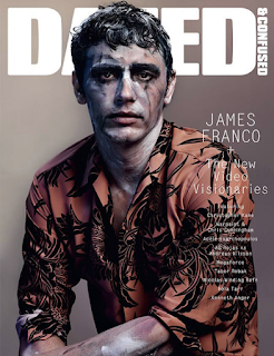
I really would like to incorporate DAZED's structurally aligned layout as I would like to be able to focus more on the actual photography of my magazine.


No comments:
Post a Comment