https://www.surveymonkey.co.uk/r/7KVNC3F
Review your results and copy and paste any graphs or charts given by surveymonkey. Then you need to write up your findings in paragraph form including how you intend to use the information collated in your questionnaire.
You can use the questions below to help you write your analysis:
What did you find useful about the information collated?
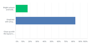
I now know that the style of print magazine cover I have chosen is one of which is wanted opposed to ones with bright colours and bold typography. Simplicity must be an aspect of my covers and content pages, so shorter tag lines in order to achieve further focus on clothing featured.
How are you going to use the information collated to establish/define a target audience for your product?
I will aim my product at mixed students who are questioning their sexuality and want more diversity in todays' magazines in regards to things such as the tones and patterns they can wear or how they should portray themselves.
What does your audience expect to see in the product you're going to create?
They will expect to see simplistic tag lines and captions so that it will not distract from the diverse artsy photography alongside fashion that stands to be just as artistic with regards to patterns, potentially distressed clothing.
How are you going to use the information collated to come up with designs and house-styles for your product?
The house-style will match the layout of Vogue due to the results of my survey, the masthead must stand out alike. I may use the light and easy fonts of GRAZIA to add to the artsy photography making my audience satisfied with the slight change in design.
https://www.surveymonkey.co.uk/r/L3XCQS9
My Online Website Survey:
https://www.surveymonkey.co.uk/r/L3XCQS9What did you find useful about the information collated?
I now know which location I would like to set my photography in, either a forest or a bathroom. Though this will not be my focus primarily, I think location will be a very crucial aspect to my magazine in regards to the adventurous theme and purpose.
How are you going to use the information collated to establish/define a target audience for your product?
Find a common ground for my brand throughout the print magazine and online website. Hence my website must also feature content of which is simplistic and artsy with regards to its layout and overall theme.
What does your audience expect to see in the product you're going to create?
My audience is expecting to see an exploration in both location and fashion norms. They would like some individualism, a website with an abnormal layout, something they have not seen before. Captions are expected to be witty and meaningful whilst outlining the contents of the images.
How are you going to use the information collated to come up with designs and house-styles for your product?
I got a summary as to how my audience would like my models to look in terms of fashion and how my website to look in terms of text to picture ratio, text is only wanted as a minimal.
DEFINE YOUR AUDIENCE
My Product is aimed at bisexual white/mixed males from the age of 16 to 25 in the AB category in full time employment questioning their sexuality, this maturity will allow them to appreciate certain themes as they will be culturally sophisticated. In regards to psychographics, my audience will be explorers who look for individualism and experience as well as valuing the differences in the magazine.


